The below video os of my finished 3D animation. The piece is the result of the work achieved through the first term of my second year of University. I think that the resulting work has achieved the effect that I wanted, and showcases what I have learnt throughout this time. I was not very proficient at Maya when I started this project, so from it I feel that I have learnt a lot. I also feel that my piece tells the story I aimed to tell well. Through the story I am also able to utilize and show off my interior layout. Now that lighting has been put into my piece, I feel that this adds to the dark atmosphere I was aiming for from the start. The music accompanying my piece ads to this atmosphere. Overall I think that this project has effectively taught me the process of creating a piece of 3D animation, and created a piece I al pleased with.
Monday, 5 December 2011
Rendering and Editing
I have now completed all of the 3D animation for my piece within Maya. The next part of the production process is to render my work, and then edit. I will edit my rendered images in Final Cut. Final Cut will take the image sequence created in Maya, and transfer it into a movie. I will do this for all the shots within my animation. After I have converted my image sequences into Quicktime movies, I will then edit these individual shots together using After Effects. While editing in After Effects, I will also add 2D animated pieces over my 3D work, and add music and sound effects to my piece.
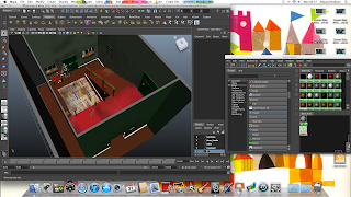
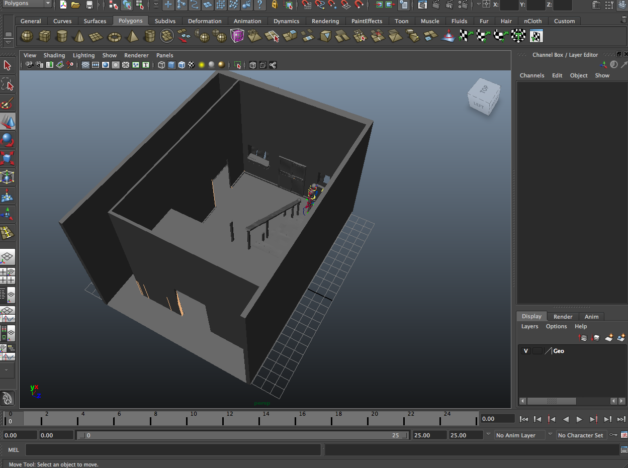
Below are examples of my rendered work.


Below are examples of my rendered work.


Tuesday, 29 November 2011
Animating in Maya
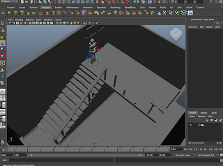
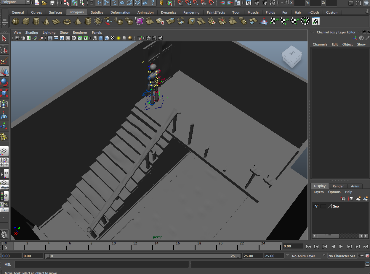
Now that the design process has been completed, I have now begun animating my "Norman" character. I am using "Norman" as he is a reliable, human character to use, with a lot of useful points of articulation. The story of my 3D animation will follow that of my storyboard, as well as the 2D piece I created. The 2D piece will be used as a template, and animatic, for the production of the 3D piece. Each shot of my piece will be created within a separate scene in Maya, which will allow me to adjust lighting, and camera work to each scene accordingly.


Thursday, 24 November 2011
2D Animated Piece - Second Run
The below video is my completely finished 2D piece. I will use this piece to inform me of the acting, posing, and staging of my 3D animation within my environment. Following the instruction of my tutor, I have made some slight alterations to the piece since my last version of it. These changes are mostly to do with the timing of the piece, as well as placing more ease in and out drawings.
Thursday, 10 November 2011
2D Animated Piece - First Run
The below video contains the 2D piece I will use to help inform me of the movements and timing I will put into my 3D animated piece. This piece is the first attempt at showing my short story through movement, and I can alter this piece in the future to fit my needs. I created the piece using Flash, following the direction of my storyboards.
Tuesday, 1 November 2011
Rendered Images
now that my model has been completely textured, I have taken a few shots of my work rendered. I have added atmospheric lighting to my piece, in order to give a better impression of how I want it to look. This lighting can be changed at a later date if I wish it to. My rendered images are below.


UV Mapping and Texturing
after the modelling stage has been finished, the next part of production is to add textures to my objects. This is done through UV mapping. Each object will be mapped, turned into a flat net that will then be textured using Photoshop. These Photoshopped textures will then be placed back onto the 3D objects.


The above picture shows the UV texture editor on the right hand side. After an object has been mapped, it in this box that the net can be moved around, transformed, and joined to other nets, in order to lose stretching that could occur on a textured object. The below pictures show examples of what these nets look like.


After I have taken these nets into Photoshop and added my desired texture, The textures are then applied back onto the objects in Maya. The textures are applied using the Hypershade menu. A basic material is placed onto the object, with the texture then being applied on top of this. the below screenshots show my work as it begins to be textured.


The above and below images show the Hypershade menu, which is used to add textures to my 3D objects in Maya.


My 3D model has now been completely textured. The next stage for my interior, is to add lights. After that, the interior will be ready to stage my animated scene.
Monday, 31 October 2011
Modelling in Maya
Now that my research and design process has got to the correct point, the next step of production can commence; modelling. Over the last couple of weeks, I have taken my design work and translated it into a 3D interior model. The process of completing this is shown in the below pictures of my work.


I began the modelling process by taking a flat plane, and extruding the walls up from this. After the main structure of my interior was built, I was free to then build up the details of the interior from the structure, such as doors and the upstairs floor.

The stairs were created separate from the main structure. I began with a cube, and extruded parts of its side in order to create the stairs effect. The banister, as well as the other props in the house, were made out of separate objects and placed together in groups.


After the modelling stage has been completed in my workflow, the next stage of production is the UV map, and texture the interior model.
Thursday, 13 October 2011
Storyboards
From my story idea that I had previously written out, I have created a series of storyboards to go with these.


Story Ideas
The next process of my process is to create a story to fit within my environment. The idea I currently have involves a person sneaking around the deserted house, being scared off by something in the room.
The story in greater detail:
A man enters the derelict interior of the house. He is scared, and is darting his torch around the room. He begins to sneak about the house, until he hears a creak coming from the second floor. He is really scared now, but his sense of curiosity overcomes this. The man cautiously sneaks on tip toes up the stairs. When he reaches the top, he peaks over the top stair, shining his torch across the landing. Seeing there is nothing there but moths, he gives a sign of relief. Suddenly, a huge threatening shadow looms over the walls. The man is petrified with fright, screaming in terror, and running from the house. The camera moves across the landing, showing that the terrifying shadow comes from a mischievous mouse. The mouse is rolling around with laughter, and is joined by a ghost laughing with him. The mouse sees the ghost, who waves happily at him. The mouse is as terrified and the man was of him, and runs off in terror. The ghost is left, alone, with a disappointed look on his face.
Wednesday, 12 October 2011
Furniture Sketches

The above drawing shows the various props that will appear within my layout. They are based upon real objects that could have been found in a house in the 1950's or 60's. As with my interior, these props have been left to ruin, so will have the same aesthetic.
My props are:
*A tall lamp
*A small table
*A vase
*Television set
*Photo frame
*Wall Clock
*Telephone
*A Cat Ornament
Wednesday, 5 October 2011
Design Idea - Coloured Version

In order to gain a better idea of my my finished layout will look, I have added colour to my sketched idea. I achieved this colour set by using water colour paints, as I thought the washed out effect of these paints would best resemble what I had in mind for my interior. I then scanned this into my computer, and changed the colour slightly using photoshop.
Tuesday, 4 October 2011
Colour Swatches

The above image shows some colour schemes I could incorporate into my finished piece. The colours I have chosen all have a muted tone, keeping in my chosen aesthetic if a dilapidated house. The predominant colours I have used are variations of grays and browns. By using dark colours, I will be able to continue the look of a dark and dank environment. As I have looked at design work from the 1950's and 60's, I have taken the predominant bright colours of the time, and toned them down to fulfill my own design ideas.
Design Idea - Floor Plan and Perspective Drawing

The above image is the floor plan of my design idea. From this I will be able to gain a better understanding of the layout of my 3D interior. I have labeled all the props that will appear within my design, as well as other key features, such as windows, doors and the archways between the rooms. My main interior will be housed within a surrounding wall, as the open archways would show an empty location without these supporting walls. This will also allow me to film my character within the environment from exciting new angles, that I wouldn't be able to achieve from a closed in space.

As well as my floor plan, I have also created this perspective drawing of my interior. This drawing adds to what can be seen on my floor plan, and gives a better idea of how the stairs and upper floor will look.
As the stairs are a main focal point of my design, I think my character animation should involve these stairs.
Monday, 3 October 2011
Initial Design Sketch

After looking into derelict house interiors, I have created the above design sketch. This primary sketch shows the atmospheric environment I hope to create. To create this design, I looked at the layout of a house, then thought what it might look like if left to go to rack and ruin. From this design idea, I will be able to progress further through my creative process, and begin designing individual elements for my 3D interior.
Saturday, 1 October 2011
Research - Derelict House Interiors
To help me with the design aspect of my work, I have looked into derelict houses. The collected images I have here are to help give me inspiration for my own design ideas. By using a search engine, I have compiled a few images that will act as a moodboard to inspire and inform my own work. From looking at these real world examples, I will be able to see the sort of textures, lighting, and aesthetic that derelict and deserted houses may contain.


Wednesday, 28 September 2011
Research - Detroit Disassembled by Andrew Moore
After looking at the period pieces of "Tinker Tailor Soldier Spy" and "Mad Men", I have gone on to look at period detail from a different angle. Andrew Moore's series of photographs entitled "Detroit Disassembled" takes period interiors from this angle. Moore photographed parts of Detroit that had become run down and derelict, and in turn creating a whole new environment. Although these spaces are no longer used, the parts left behind take on a whole new meaning and purpose, and for me, can be used as inspiration for a animated environment.


I think that an interesting idea for my 3D interior could include a mixture of 1950s - 70s period detail, and imagine what it would look like in modern times. This way I can take what I have learnt from the set designs of "Tinker..." and "Mad Men", and apply it to the work of Andrew Moore.


Research - Mad Men
From looking at the period setting of "Tinker Tailor Solider Spy", I have gone on to look at "Mad Men". The series is set in the 1960s, so have a different style to the 70's set "Tinker...", but maintains the same level of period detail.
During it's production time "Mad Men" has become well know for its portrayal of 1960's American life. One of my favourite aspects of the show its it's flawless interior design. As with "Tinker...", "Mad Men" brings it's time period to life. The main settings of the show are the offices of the Sterling Cooper Advertising agency, and the home of main character Don Draper.


During it's production time "Mad Men" has become well know for its portrayal of 1960's American life. One of my favourite aspects of the show its it's flawless interior design. As with "Tinker...", "Mad Men" brings it's time period to life. The main settings of the show are the offices of the Sterling Cooper Advertising agency, and the home of main character Don Draper.


Whereas "Tinker..." had a drab, foreboding aesthetic, "Mad Men"'s style is far more bright and optimistic. These office interiors have all the correct period features, drawing the viewer into the world of the character. As the setting is so believable, the characters who inhabit them too become believable. These sets show a functional environment, but also one that is a product of it's time.


Set against the stylish functionality of the office environment, are the home interiors of "Mad Men". The home of Don and Betty Draper is a perfect image of 1960's life. I admire the detail of these home interiors as the viewer is able to gain a real sense of story from them, and learn more about it's characters. Whereas Don has a very minimalist office space (in order to distance his personal life from work), his home has more personal features, creating an environment that could be inhabited by a 1960's family.
The period details in "Mad Men" are very impressive. As a set design, they are able to give the viewer an accurate impression of the time, as well as creating a believable backdrops for the series' many characters.
Subscribe to:
Posts (Atom)